

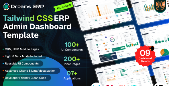
Dreams ERP Next.js is a modern, responsive enterprise administration dashboard built with Next.js 16 (App Router), React 19, TypeScript, and Tailwind CSS v4. It provides prebuilt components and pages to manage employees, CRM, finance, inventory, projects, and more in a unified dashboard.
– Built with Next.js 16 App Router
– React 19.3.0 + TypeScript
– Server Components with route-group layouts
– Static HTML export ready (output: "export")
– Redux Toolkit state management
– Tailwind CSS v4 (CSS-first config)
– Ant Design v6 component library
– 6 layout variants (default, mini, hoverview, hidden, full-width, RTL)
– Light & dark mode with no flash on load
– Fully Responsive Design
– 220+ prebuilt pages across CRM, HRM, Finance, Inventory, Projects, Sales, Purchase, POS
– ApexCharts, Chart.js & ECharts
– Self-hosted icon webfonts
– React Compiler enabled
– Mock-first data layer with swappable REST services
– Working CRUD on list, add, edit & details pages
– Demo authentication with role-based access
– PDF / Excel export and print-ready pages
– ERP document flow (quote → order → delivery → invoice)
– Compatible Browsers: Firefox, Safari, Opera, Edge, Chrome
– Easy to Customize with css Variables
Project Overview
The project follows a modular structure with clear separation of concerns.
nextjs/
├── public/
│   └── assets/img/          # avatar, card, icons, product, logo.svg, logo-small.svg, logo-white.svg
├── src/
│   ├── app/                 # App Router
│   │   ├── (auth-pages)/         # 20 pages  -> AuthLayout
│   │   ├── (layout-demo-pages)/  # 5 pages   -> LayoutDemoShell
│   │   ├── (pos-pages)/          # 1 page    -> PosLayout
│   │   ├── (public-pages)/       # 196 pages -> PublicLayout
│   │   ├── globals.css
│   │   ├── layout.tsx            # root layout
│   │   ├── apple-icon.png
│   │   └── favicon.png
│   ├── components/          # 16 shared components
│   ├── config/metadata.ts   # getPageMetadata() helper
│   ├── core/
│   │   ├── api/             # http client + services/ (one per entity)
│   │   ├── auth/            # demo accounts, roles, access rules
│   │   ├── data/            # interface.ts + mock/ (bundled sample data)
│   │   ├── domain/          # ERP flows, audit log, id generation, store
│   │   ├── export/          # PDF / Excel export
│   │   ├── hooks/           # useCrudModal - modal + form binding
│   │   └── ui/              # toast + overlay helpers
│   ├── hooks/               # useDebouncedValue, useTagInput
│   ├── layout/              # authLayout, publicLayout, posLayout,
│   │                        # layoutVariantWrapper, layoutDemoShell
│   ├── providers/           # LayoutSync.tsx, StoreProvider.tsx
│   ├── redux/               # store.ts, hooks.ts, slices/layoutSlice.ts
│   ├── routes/all_routes.tsx  # central path constants
│   ├── style/
│   │   ├── css/style.css    # theme tokens + Tailwind entry
│   │   └── icons/           # self-hosted icon webfonts
│   ├── utils/json/          # commonSelectOption, sidebarMenu
│   ├── views/               # page modules
│   └── environment.tsx
├── eslint.config.mjs
├── next.config.ts
├── package.json
├── postcss.config.mjs
└── tsconfig.json
Route groups inside (public-pages)
(advanced-ui), (application-pages), (assets), (base-ui), (charts), (crm), (dashboard), (documents), (finance), (forms), (hrm), (icons), (inventory), (membership), (pos), (projects), (purchase), (sales), (support), (system), (tables), (utilities)
Folders wrapped in parentheses are route groups. They organise files without adding a URL segment, so (base-ui)/ui-accordion/page.tsx is served at /nextjs/ui-accordion. There is no src/app/page.tsx – the / redirect in next.config.ts handles the root.
Shared Components (src/components/)
breadcrumb, common-date-picker, common-date-range-picker, common-footer, common-header, common-lightbox, common-select, common-sidebar, common-tag-input, data-table, image-with-base-path, multiple-Select, password-input, preview-code-toggle, skeleton, text-editor
Page Modules (src/views/)
assets, auth-pages, blank-page, crm, documents, finance, hrm, inventory, main-pages, membership, pos, projects, purchase, sales, support, system, ui-interface
Structure Overview
Dreams ERP Next.js uses the App Router with route groups and nested layouts to keep the app scalable and maintainable.
Layouts nest from the outside in: the root src/app/layout.tsx renders the <html> and <body> shell, then each route group applies its own layout, then the page renders.
| ROUTE GROUP | PAGES | LAYOUT |
|---|---|---|
(public-pages) | 196 | PublicLayout – sidebar + header shell |
(auth-pages) | 20 | AuthLayout – bare |
(layout-demo-pages) | 5 | LayoutDemoShell |
(pos-pages) | 1 | PosLayout |
Each group layout is a one-liner that delegates to the matching file in src/layout/.
Below is the root layout, src/app/layout.tsx:
import { Metadata } from "next";
import StoreProvider from "../providers/StoreProvider";
import LayoutSync from "../providers/LayoutSync";
import { THEME_KEY } from "../redux/slices/layoutSlice";
import "../style/icons/@phosphor-icons/web/duotone/style.css";
import "../style/icons/@phosphor-icons/web/regular/style.css";
import "../style/icons/@phosphor-icons/web/fill/style.css";
import "../style/icons/lucide-static/font/lucide.css";
import "../style/icons/@fortawesome/fontawesome-free/css/fontawesome.min.css";
import "../style/icons/@fortawesome/fontawesome-free/css/all.min.css";
import "../style/css/style.css";
import "./globals.css";
import "preline";

export const metadata: Metadata = {
  title: "Dreams ERP - Tailwind CSS ERP Admin Dashboard Template",
  description: "Dreams ERP is a professional Tailwind CSS ERP Admin Dashboard Template ...",
  authors: [{ name: "Dreams Technologies" }],
  icons: {
    icon: "/nextjs/assets/img/favicon.png",
    apple: "/nextjs/assets/img/apple-icon.png",
  },
};

export default function RootLayout({ children }: Readonly<{ children: React.ReactNode }>) {
  return (
    <html lang="en" data-theme="light" suppressHydrationWarning>
      <head>
        <script
          dangerouslySetInnerHTML={{
            __html: `(function(){try{if(localStorage.getItem(${JSON.stringify(
              THEME_KEY,
            )})==="dark")document.documentElement.setAttribute("data-theme","dark")}catch(e){}})()`,
          }}
        />
        <link rel="preconnect" href="https://fonts.googleapis.com" />
        <link rel="preconnect" href="https://fonts.gstatic.com" crossOrigin="anonymous" />
        <link href="https://fonts.googleapis.com/css2?family=Geist:wght@100..900&display=swap" rel="stylesheet" />
      </head>
      <body>
        <StoreProvider>
          <LayoutSync />
          {children}
        </StoreProvider>
      </body>
    </html>
  );
}
Three things worth noting in the root layout
- The
metadataexport – Next's Metadata API sets the title, description and icons. No head-management library is needed. - The inline theme script – it reads
localStorage["dt-theme"]and appliesdata-theme="dark"before first paint, which prevents a flash of the light theme.suppressHydrationWarningon<html>is required because that script mutates the DOM before React hydrates. - Geist via Google Fonts – loaded with a preconnect and stylesheet link in the head.
Page metadata and paths
Individual pages export generateMetadata using the getPageMetadata(pageName) helper from src/config/metadata.ts. The src/routes/all_routes.tsx map survives as a central set of path constants used by the sidebar menu and links.
Overview
Pages no longer hold their own hardcoded arrays. Every list reads through a
service in src/core/api/services/, which returns the bundled sample data by
default and calls a REST endpoint once you point it at a backend. The sample data itself
lives in src/core/data/mock/.
Mock-first services
Each entity has a four-line service built with createCrudService(name, endpoint, seed).
It exposes useList() for read-only pages and useCrud() for pages with
Add / Edit / Delete, returning { data, isLoading, refetch, create, update, remove }.
import { createListService } from "../createCrudService";
import { refunds, type Refund } from "../../data/mock/refunds";

export const refundsService = createListService<Refund>("refunds", "/refunds", refunds);
export const useRefunds = refundsService.useList;
export const useRefundsCrud = refundsService.useCrud;
Switching to a real API
Mock mode is the default. Set the environment variables below to call your own backend instead – the pages do not change, because they only talk to the service.
| Variable | Default | Description |
|---|---|---|
NEXT_PUBLIC_USE_MOCK | true | Set to false to use the REST endpoints. |
NEXT_PUBLIC_API_URL | empty | Base URL of your API. |
With mock mode on, changes are kept in the browser under the
erp-data: storage keys, so they survive a reload. The bundled sample data is never
modified. Run __erp.resetDemoData() in the browser console to restore it.
CRUD on the existing screens
The Add, Edit and Delete modals that ship with each list page are wired up. Their markup is
unchanged – the row that was clicked is tracked with openRow() /
useSelectedRow(), the inputs are bound with useModalForm() from
src/core/hooks/useCrudModal.ts, and a short confirmation appears after a save.
New records continue each list's own numbering, for example #RF0020 → #RF0021.
Edit and details pages accept an optional record id in the query string, for example /edit-employee?id=%23EMP0020. The id is read with useRecordId() from src/views/crudFormHelpers.ts. Opening the same page without an id keeps the original static sample content, so existing links still work. A query string is used rather than a dynamic route segment because output: "export" would otherwise require every id to be pre-rendered at build time.
Authentication & roles
The sign-in page is pre-filled with a demo account, so signing in stays one click.
Accounts are defined in src/core/auth/demoUsers.ts; register, forgot-password,
verification, reset and lock-screen all work against them. Signed-out visitors are redirected to
the login page.
| Role | Sees | May |
|---|---|---|
| Admin | Every section | Create, edit and delete |
| Manager | All but System | Create, edit and delete |
| Staff | Core modules only | Create and edit |
The rules live in src/core/auth/access.ts (which sidebar sections a role may
open) and src/core/auth/permissions.ts (the <Can> wrapper that hides
an action). Edit those two files to change who can do what.
Export & print
The Export as PDF and Export as Excel items in the toolbar produce real
files containing exactly the rows on screen, including the current search, filter, sort and column
choices. This is handled centrally by useExportLinks() in the public layout, so the page
markup did not need to change. Print buttons open the browser print dialog, and a print stylesheet
hides the header, sidebar and footer.
ERP document flow
Changing a record's status can create the next document in the chain. The rules are in
src/core/domain/flows.ts and each one writes an entry to Audit Logs.
| Module | Flow |
|---|---|
| Sales | Quote accepted → order → delivery note → invoice; a refunded invoice raises a refund |
| Purchase | RFQ awarded → purchase order approved → purchase received → payment |
| Inventory | Stock adjustments and completed transfers update stock levels |
| HRM | Offer accepted → onboarding → employee |
| CRM | Lead converted → deal |
The providers are mounted in src/app/layout.tsx: StoreProvider seeds the Redux store (theme and session) on the client, and QueryProvider supplies the query client and registers the ERP flow rules. Pages that read ?id= are wrapped in a <Suspense> boundary inside their *Client.tsx file, which the App Router requires for useSearchParams.
Nothing in the design changed. With no edits made, every page renders exactly the sample content it always did – the data simply arrives through a service now.
Prerequisites
Node.js and NPM :
Ensure that Node.js is installed and running on your system.
https://nodejs.org/en/download/
Package Manager
Use npm (recommended with this project lockfile) or Yarn if preferred.
npm -vNext.js
Next.js is the framework and build tool. It is installed automatically as a project dependency – no global installation required.
https://nextjs.org/
Installation Steps
Extract & Navigate
After downloading, extract the Dreams ERP package and navigate to the nextjs directory.
Install Dependencies
npm installBefore proceeding you'll need to install npm packages. You can do this by running npm install from the root of your project to install all the necessary dependencies.
Start Development Server
npm run devFor running a project, run the command
Open in Browser
Open your browser at http://localhost:3000. The dev server runs at the root, so no path prefix is needed, and / redirects to /login. A production build is served under /nextjs instead – see Base Path.
Build for Production
npm run buildBecause output: "export" is set, this produces a static HTML export in the out/ directory, which can be served by any static host. The next start script exists but is not the intended serving path for a static export.
CSS-first configuration
This project uses Tailwind CSS v4.3.2, which is configured in CSS rather than JavaScript. There is no content array and no tailwind.config.js in this project at all – the @source directive replaces them. Tailwind is wired in through PostCSS.
The PostCSS setup in postcss.config.mjs is the whole integration:
const config = {
  plugins: {
    "@tailwindcss/postcss": {},
  },
};

export default config;
All configuration lives at the top of src/style/css/style.css:
@import url('https://fonts.googleapis.com/css2?family=Geist:wght@100..900&display=swap');

/* 1. ALL @imports must be at the very top */
@import "tailwindcss";
@import "../../../node_modules/preline/variants.css";

/* 2. Then @plugin and @source */
@plugin "@tailwindcss/forms";
@source "../../../node_modules/preline/dist/*.js";

/* 3. Then @layer and @custom-variant */
@layer theme, base, components, pages, utilities;
@custom-variant dark (&:where([data-theme="dark"], [data-theme="dark"] *));
What each directive does
@source– tells Tailwind which extra files to scan for class names. It replaces thecontentarray from v3.@plugin "@tailwindcss/forms"– better default styling for form elements.@import "preline/variants.css"– Preline v4 supplies the headless JavaScript behaviour for dropdowns, overlays and tabs.@custom-variant dark– makes everydark:utility key off thedata-themeattribute.
src/app/globals.css holds component-level overrides (rich text editor, scrollbars and similar) layered on top of the theme tokens.
Overview
The template is published under a sub-folder, so a build prefixes every route and
asset with /nextjs. The dev server runs at the root instead, which keeps local
URLs short while you work.
| Command | Base path | Example URL |
|---|---|---|
npm run dev | none | http://localhost:3000/login |
npm run build | /nextjs | /nextjs/login |
The value is chosen in next.config.ts from the build phase and published to the
client as NEXT_PUBLIC_BASE_PATH, which src/environment.tsx reads. Change the
BASE_PATH constant to deploy under a different folder, or set it to "" to serve
from the domain root.
const BASE_PATH = "/nextjs";

export default (phase: string): NextConfig => {
  const basePath = phase === PHASE_DEVELOPMENT_SERVER ? "" : BASE_PATH;

  return {
    basePath,
    env: { NEXT_PUBLIC_BASE_PATH: basePath },
    output: "export",
    // ...
  };
};
next/link applies the base path on its own. Plain <img> tags do
not, so they go through image_path from src/environment.tsx. The value is
inlined at build time and cannot be changed afterwards without rebuilding.
You can easily update the logo in two ways:
Option 1: Overwrite Logo Image Files (Recommended)
Directly replace the default SVG logo files in the public/assets/img/ directory with your own logos using the same file names:
logo.svg: Main logo (shown in light mode).logo-small.svg: Small square logo (shown when sidebar is collapsed/minimized).logo-white.svg: White text logo (shown in dark mode).
Option 2: Update the React Components
If you want to use different names or paths, open src/components/common-header/ and src/components/common-sidebar/, then search for the logo tags and modify their src attribute.
About image paths
Images are rendered through the shared src/components/image-with-base-path/ component. It prefixes image_path from src/environment.tsx onto every image URL, which is why asset paths resolve correctly under /nextjs/.
This project renders plain <img> tags rather than next/image – the @next/next/no-img-element ESLint rule is intentionally disabled. Because output: "export" is set, next/image would require the unoptimized flag to work.
The default typography font for the template is Geist. It is loaded in two places, and both must be updated when you change it:
1. The Google Fonts link in src/app/layout.tsx
<link
  href="https://fonts.googleapis.com/css2?family=Inter:wght@100..900&display=swap"
  rel="stylesheet"
/>
2. The import and token in src/style/css/style.css
/* Import the new Google Font at the very top of style.css */
@import url('https://fonts.googleapis.com/css2?family=Inter:wght@100..900&display=swap');

/* Update the variable inside the @theme block */
@theme {
    --font-family-primary: "Inter", sans-serif;
}All theme colors are defined as design tokens under the @theme directive in your src/style/css/style.css file. These variables control the look and feel of components:
@theme {
    --font-family-primary: "Geist", sans-serif;

    --color-primary: #0F766E;   /* primary color */
    --color-secondary: #2563EB; /* secondary color */
    --color-dark: #1E293B;      /* dark surfaces */

    /* System Colors */
    --color-success: #059669;   /* success states */
    --color-warning: #D97706;   /* warnings */
    --color-danger: #B91C1C;    /* error states */
    --color-info: #0EA5E9;      /* informational */
}
The same block also defines the primary shades --color-primary-100 through --color-primary-900, plus --color-primary-hover, so you can tune hover and accent states without touching component code.
Changing Element Colors
You can customize the color of any element by editing its class or variable assignment in the CSS file. For example, changing the header topbar background color:
.navbar-header {
    @apply bg-(--topbar-bg);
}How it Works
Dark mode state is managed in Redux and persisted to localStorage under the key dt-theme. A sync component writes the current theme to a data-theme attribute on the <html> element, which a Tailwind custom variant reads to apply dark: utility classes.
The theme lives in src/redux/slices/layoutSlice.ts, and src/providers/LayoutSync.tsx is the single bridge that writes it to the DOM:
document.documentElement.setAttribute("data-theme", layout.theme);In src/style/css/style.css, a custom Tailwind variant reacts to that attribute so any dark: utility applies automatically:
@custom-variant dark (&:where([data-theme="dark"], [data-theme="dark"] *));

/* usage example */
body { @apply dark:bg-none dark:bg-[#1A1A1A]; }
Server rendering: avoiding a hydration mismatch
This is the main difference from a client-only React build. The server has no localStorage, so the theme has to be resolved carefully in two stages.
1. A per-request store – src/providers/StoreProvider.tsx seeds the store like a lazy initializer. On the server readStoredTheme() returns "light", matching the server-rendered HTML; in the browser it reads the same key the inline script used, so the store and DOM agree:
storeRef.current = makeStore({
  layout: { ...defaultLayoutState, theme: readStoredTheme() },
});
2. A pre-paint script – the root layout runs a small blocking script in <head> that applies the dark attribute before the browser paints, so a dark-mode user never sees a white flash:
(function () {
  try {
    if (localStorage.getItem("dt-theme") === "dark")
      document.documentElement.setAttribute("data-theme", "dark");
  } catch (e) {}
})();
Because that script mutates the DOM before React hydrates, the root <html> element carries suppressHydrationWarning.
Right-to-Left layout is driven through Redux rather than by hand-editing markup. Dispatching setVariant("rtl") makes LayoutSync add dir="rtl" to the <html> tag and toggle the layout-rtl class on the body:
<html lang="en" dir="rtl">Tailwind CSS automatically transforms positioning utilities (like margins, padding, and flex alignments) using standard logical properties when the dir="rtl" attribute is active.
RTL Demo
A preconfigured RTL demo is available at the /layout-rtl route. See src/app/(layout-demo-pages)/layout-rtl/ for a live demonstration.
Dreams ERP includes multiple popular icon packages ready for use. All of them are self-hosted webfonts under src/style/icons/ and imported in src/app/layout.tsx – no CDN request is made. You can use any of the following icon libraries:
1. Lucide Icons
Use Lucide icons with the icon-[name] class prefix:
<i class="icon-house"></i>
<i class="icon-users"></i>
<i class="icon-settings"></i>
2. Phosphor Icons
Use Phosphor icons with the ph-[style] ph-[name] prefix classes. The duotone, regular and fill styles are imported:
<i class="ph-duotone ph-plus-circle"></i>
<i class="ph-fill ph-calendar"></i>
<i class="ph ph-user"></i>
3. Font Awesome Icons
Use Font Awesome Free icons with standard classes:
<i class="fa-solid fa-hashtag"></i>
<i class="fa-brands fa-react"></i>Dreams ERP ships six layout variants, all driven from Redux. The variant type is declared in src/redux/slices/layoutSlice.ts:
export type LayoutVariant = "default" | "mini" | "hoverview" | "hidden" | "full-width" | "rtl";src/providers/LayoutSync.tsx applies the active variant by writing a data-layout attribute on <html> and toggling body classes (mini-sidebar, expand-menu, hidden-layout, full-width, layout-rtl). All variants support light and dark modes.
Demo routes
Each variant has a live demo page under src/app/(layout-demo-pages)/:
/layout-mini– icon-only collapsed sidebar./layout-hoverview– mini sidebar that expands on hover viaexpand-menu./layout-hidden– sidebar fully hidden, toggled in on demand./layout-fullwidth– full-width content with the sidebar as an overlay./layout-rtl– right-to-left layout.
How the demos work
The group layout renders src/layout/layoutDemoShell.tsx, which derives the variant from the URL segment rather than from a per-page prop:
const VARIANT_BY_SEGMENT: Record<string, LayoutVariant> = {
  "layout-mini": "mini",
  "layout-hoverview": "hoverview",
  "layout-hidden": "hidden",
  "layout-fullwidth": "full-width",
  "layout-rtl": "rtl",
};

const LayoutDemoShell = ({ children }: { children: ReactNode }) => {
  const segment = usePathname().split("/").filter(Boolean).pop() ?? "";
  const variant = VARIANT_BY_SEGMENT[segment] ?? "default";

  return <LayoutVariantWrapper variant={variant}>{children}</LayoutVariantWrapper>;
};
Each demo route is a server page.tsx that exports generateMetadata via getPageMetadata, paired with a *Client.tsx that dynamic(..., { ssr: false })-imports the shared view from @/views/main-pages/layout-demo/.
The default vertical layout with a left sidebar, topbar, and center content area. It is applied by the (public-pages) route group.
- Sidebar: Navigation menu, logo, profile details, and collapsible dropdowns.
- Topbar: Search input, user alerts, settings, and profile toggle actions.
- Responsive: Collapses into an overlay sidebar on tablets and mobile screens automatically.
A screen-saving option that collapses the sidebar to show icons only. LayoutSync adds the mini-sidebar class to the <body> when the variant is active. See the /layout-mini demo route.
- Icon View: Collapses the sidebar to maximize the main work area.
- Hover Expand: Hovering expands the sidebar to reveal module text labels (the
hoverviewvariant). - Toggle: Switch between default and mini sidebar using the toggle button in the topbar.
Dreams ERP comes with 24+ pre-styled UI components. The routes live in src/app/(public-pages)/(base-ui)/ with their views in src/views/ui-interface/, or click below to view their live layouts:
Dreams ERP is developed by Dreams Technologies and is available under both Envato Extended & Regular License options.
Regular License
Usage by either yourself or a single client is permitted for a single end product, provided that end users are not subject to any charges.
Extended License
For use by you or one client in a single end product for which end users may be charged.
What are the main differences between the Regular License and the Extended License?
If you operate as a freelancer or agency, you have the option to acquire the Extended License, which permits you to utilize the item across multiple projects on behalf of your clients.
| NAME | URL |
|---|---|
| Next.js | https://nextjs.org/ |
| React | https://react.dev/ |
| Ant Design | https://ant.design/ |
| Tailwind CSS | https://tailwindcss.com/ |
| Preline | https://preline.co/ |
| Redux Toolkit | https://redux-toolkit.js.org/ |
| React ApexCharts | https://www.npmjs.com/package/react-apexcharts |
| Chart.js | https://www.chartjs.org/ |
| ECharts | https://echarts.apache.org/ |
| FullCalendar | https://fullcalendar.io/ |
| Hello Pangea DnD | https://www.npmjs.com/package/@hello-pangea/dnd |
| React Quill New | https://www.npmjs.com/package/react-quill-new |
| noUiSlider | https://refreshless.com/nouislider/ |
| React Select | https://react-select.com/ |
| React Window | https://www.npmjs.com/package/react-window |
| Yet Another React Lightbox | https://yet-another-react-lightbox.com/ |
| Fontawesome | https://fontawesome.com/ |
| Phosphor Icons | https://phosphoricons.com/ |
| Lucide | https://lucide.dev/ |
If you have any questions or run into issues with the template, feel free to contact us via email at support@dreamstechnologies.com.
Response Time: Typically 12–24 hours on weekdays (GMT+5:30). Support covers template bugs, errors, and standard features. It does not cover custom installations or custom coding changes.
Contact SupportDo you need custom development for your application?
If you need customization, new page integration, feature setups, or database connections, our engineering team can help tailor this template to your precise specifications.
- Tailoring features to your exact branding and workflow.
- Deploying the template to your production servers.
- Integrating backend endpoints and databases.

Thank You
Thank you for choosing Dreams ERP! We hope this template facilitates building your application. We kindly ask you to share your feedback by leaving a rating on ThemeForest.
Leave a Review